
Editing a mailing or newsletter
Learn how to use Maileon’s editor and how to follow the editorial guidelines.
Topics on this page
Choosing a template ›
Select the template designed for your type of newsletter or mailing.
Fixed elements ›
Content that is always included in your mailing or newsletter.
Working with blocks ›
Choose from various pre-designed elements, and add (personalised) text, images, and buttons.
Previewing ›
See how your mailing will look.
Test mailing ›
Send your mailing or newsletter to one or more test addresses.

Starting a New Mailing? Choose a Template
When creating a new newsletter or mailing, Maileon prompts you to choose a template. Select the first option (Saved templates) and navigate to the folder Standard Templates Leiden University, which contains two templates:
Template ‘Mailing’
For text-heavy mailings with little or no visual content.
Template ‘Newsletter’
For mailings with engaging headlines, short texts, and plenty of images.
Select a template by double-clicking it or selecting it once and clicking the black Select element button.
Check the version of the template
Each template includes a version number in the title and at the top of the template itself.
If you’ve created a custom template or used a previous mailing as the basis for a new one, it is advisable to check whether the version number in that template matches the version listed below. There may be a newer, improved version available.
Newsletter template
Most recent version: 250414
Mailing template
Most recent version: 250414
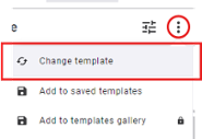
If you’re using an outdated version, it’s best to update the template. To do this, click the three dots in the top-right corner and select Change template.
Fixed elements
Your newsletter or mailing will always include a header and footer.
Header components
- University logo
- Title
- Subtitle
Optionally, you can add a button linking to a version in another language if needed. See the page Bilingual mailings for more information.
The subtitle in the newsletter template automatically displays the current date using a field code. You can replace this with custom text if desired.
Footer components
- Unsubscribe link (for external mailings)
- Link to update personal details (email address, name; only visible in external mailings)
- Social media links
You can edit the addresses of the social media icons. Remove any unnecessary social media icons by clicking on the icon and deleting it in the right-hand panel.
Working with blocks
Add blocks to your design. These blocks are preconfigured in terms of layout, colors, fonts, and alignment to match the template. The blocks available depend on the template you are using:
Banner image
Place it at the top of your newsletter, if desired.
Call to action
A coloured text box with a call to action button. You customise the text of the button by clicking on it and then in the right-hand panel in the field. In the section Buttons, lower down on this page, you will read how to customise the text on the button and add a link. You can also remove the button.
Contact & socials
A contact button and a button that links to a website. Remove the button(s) you don't need. You can also remove the entire button.
Add to the social media icons you need the correct address and remove the icons you don't need. You can also remove the entire bar of social media icons.
Frame with small image
If you want, you can reverse the order of the text and image.
Language button
Allows you to refer to a foreign-language version of your newsletter or mailing in another language. See also: Bilingual dispatches.
List block
There are several variants with a corresponding icon:
- Events
- In the media
- Laureates
- Announcements
- More news
Two narrow blocks
This block is composed of two narrow blocks, each containing an image , kicker, heading and intro text.
Two narrow header links
Two narrow blocks, each consisting of a kicker and a clickable header. The difference with the element Two narrow blocks described above is that there is a coloured arrow after the heading.
Wide header link
This block covers the full width of the newsletter and consists of a kicker and a clickable header.
Wide block
A full-width block that consists of an image, kicker, header and intro text by default.
Wide block with small image
A full-width block in the newsletter that consists of an image, kicker, header and intro text by default. The image is to the left or right of the text.
Banner image
Use this to increase the recognisability of your newsletter. Do not use banner images in which you have placed text (using software that allow you to edit images, such as Photoshop or Canva).
Call to action box
A colored text box with a call-to-action button. Adjust the button text by clicking on it and editing the field in the right-hand panel. See the Buttons section for instructions on customisation or link removal.
Frame with small image
If you want, you can reverse the order of the text and image.
Large image
A block for a full-width image, with an optional caption.
Language button
Links to a version of the mailing in another language. See also: Bilingual mailings.
Paragraph
A text block with a paragraph heading (which you can remove if not needed).
Paragraph with small image
A text block with a small adjacent image. You can change the image alignment.
Adding a block
On the right-hand side, go to the Saved section and under the Folder heading, navigate to the folder for the template you are using—Newsletter or Mailing. Select the desired block by holding it with the left mouse button and dragging it to the desired location in your newsletter or mailing. You can place a block anywhere where “Drop block here” is displayed, but not above the title bar or below the footer.
Only use the blocks located under the Saved tab, as described above. Do NOT use the blocks under the Widgets and Blocks tabs.
Check block version numbers
If you’re using a copy of a previous newsletter or mailing, or have saved your own version of a template, check whether newer versions of any blocks you’ve used are available. Each block has a version code, such as 241118. Compare this code to the list below. If the block is outdated, replace it by dragging the updated version into your design and deleting the old one.
Block version numbers for the newsletter template
- Events block (Agendablok) - 250404
- Wide header link (Brede koplink) - 250404
- Wide block (Breed blok) - 250404
- Wide block with small image - 250404
- Call to action - 250404
- Contact and socials - 250404
- Frame with small image - 250404
- Announcements block (Mededelingenblok) - 250404
- In the media block (In de media-blok) - 250404
- More news block (Meer nieuws-blok) - 250404
- Language button (Taalknop) - 250404
- Laureates block (Laureatenblok) - 250404
- Two narrow blocks (Twee smalle blokken) - 250404
- Two narrow header links (Twee smalle koplinks) - 250404
Block version numbers for the mailing template
- Paragraph (Alinea) - 250404
- Paragraph with small image (Alinea met kleine afbeelding) - 250404
- Banner image (Bannerafbeelding) - 250404
- Call to action- 250404
- Frame with small image - 250404
- Contact and socials - 250404
- Large image (Grote afbeelding) - 250404
- Language button (Taalknop) - 250404
- Subheading (Tussenkop) - 250404
Editing a block
Below you will find instructions on how to add content to the blocks in your newsletter or mailing.

In the editor, you can (slightly) adjust the formatting of your text, add links, and personalize the content.
To edit a headline or paragraph, click on it, and you can start typing immediately. If you want to apply formatting, personalize the text, or add a link, double-click the text box or click the pencil icon in the dark toolbar above the text field.
Adding a link
- Select the text you want to turn into a link. If you want to make a headline in a newsletter clickable, ensure you select the entire headline text rather than clicking on the block containing the headline.
- Press the chain icon in the toolbar.
- Choose web address from the list of options.
- A new window will appear.
- Type or paste the desired address into the field labeled URL.
- Below this field, you will immediately see whether the entered address is reachable—this reduces the risk of dead links in your mailing.


Personalisation
If needed, you can personalize texts. Using special field codes, you can retrieve data from the address list (e.g., the recipient's name) and display it in the text. Fortunately, you don’t need to type these field codes manually; you can insert them into your mailing via the menu.
- Place the text cursor where the personalized text should appear (e.g., after the salutation "Dear").
- In the toolbar, click the button with the two curly braces.
- Choose the option Contact fields.
- Select the contact field whose value you want to display in your mailing. For example, First Name.
Learn how to insert images into your design and add links if necessary.
Uploading an image
After dragging a block with an image into your design, you need to replace the placeholder image with your own. The placeholder image specifies the required dimensions for the new image.

- Click on the image you want to replace.
- In the right-hand panel, press the cloud with arrow button.
Adding a link
After selecting the image by clicking on it, follow these steps:
- In the right-hand panel, press the + Define link button.
- Choose Web address from the list of options.
- A new window will appear.
- Type or paste the desired address into the field labeled URL.
Below this field, you will immediately see whether the entered address is reachable—this reduces the risk of dead links in your mailing.
- Leave the Track clicks toggle switched on.
- Adding a tag is unnecessary.
- Finally, press the Add link button.
Editing button text
- Type the desired button text into the Label field in the right-hand panel.
- You can leave the Button Layout field unchanged.

Adding a link
If you want to modify a button, you must first click on it in the design.
- In the right-hand panel, press the + Define link button.
- Choose Web address from the list of options.
- A new window will appear.
- Type or paste the desired address into the field labeled URL.
Below this field, you will immediately see whether the entered address is reachable—this reduces the risk of dead links in your mailing.
- Leave the Track clicks toggle switched on.
- Adding a tag is unnecessary.
- Finally, press the Add link button.
You can move, duplicate, and delete a block in your design using the designated buttons. These appear in a toolbar when you select a block.

It is important to select the entire block and not just one of its components. If you click on the block and see that one of its components has a blue border with a larger gold-colored border around it, you have not yet selected the complete block. Press the button with the icon of two overlapping rectangles in the toolbar (hovering over it displays the tooltip ‘Select parent element’) to select the entire block. The complete block will now have a blue border. For some blocks (e.g., list blocks with an icon), you may need to press the button more than once to select the entire block.


Change block composition
Each block consists of individual elements that you can remove after dragging the block into your design if necessary.
For example:
- Use a headline in a newsletter intro but no subheading.
- Create a newsletter intro without an image.
- Use a text box without the accompanying call-to-action button.

Removing an element
- Click on the element you want to remove.
- Press the trash can icon in the toolbar.

Viewing a preview
While editing your mailing, you may want to see how the final display will appear. Use the Preview button at the top of the screen for this purpose.
You can adjust the preview display in several ways:
- As plain text.
- On a smaller screen size.
- With dark mode enabled.
- Without images.

Test mailing
The preview feature provides a good impression of your newsletter or mailing, but it’s also advisable to send a test version to your own address and/or a colleague’s. Click the Send test button at the top of the screen and enter the address(es) to which you want to send the test.
If you frequently need to send test mailings to multiple addresses, it’s inefficient to re-enter them each time. In that case, you can:
- Save the relevant email addresses in a plain text document and copy-paste them from there.
- Request that your faculty or department’s Maileon data manager creates a test mailing list. You can then select this list under the Quality Assurance tab by clicking Test Mailing.
